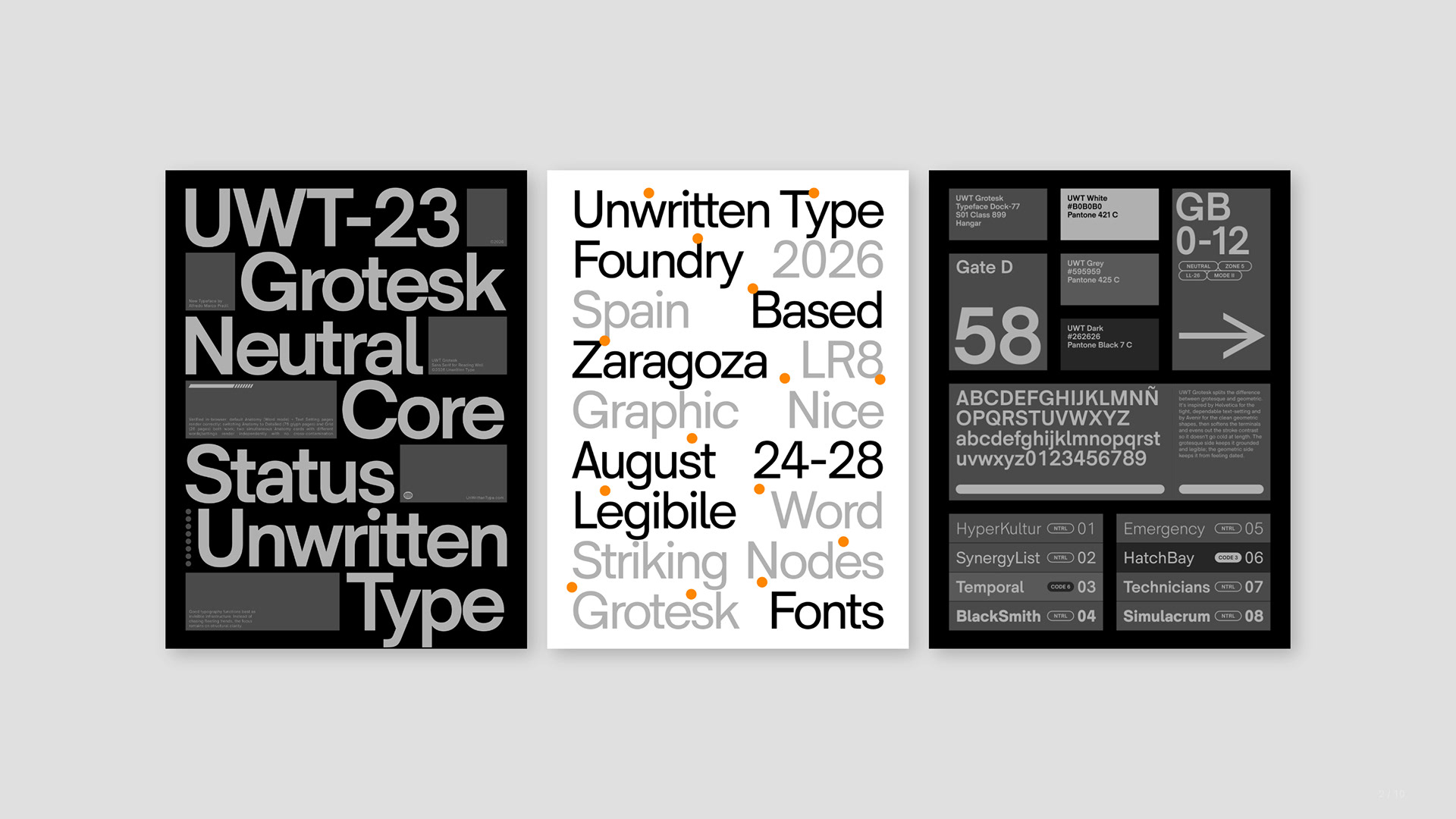
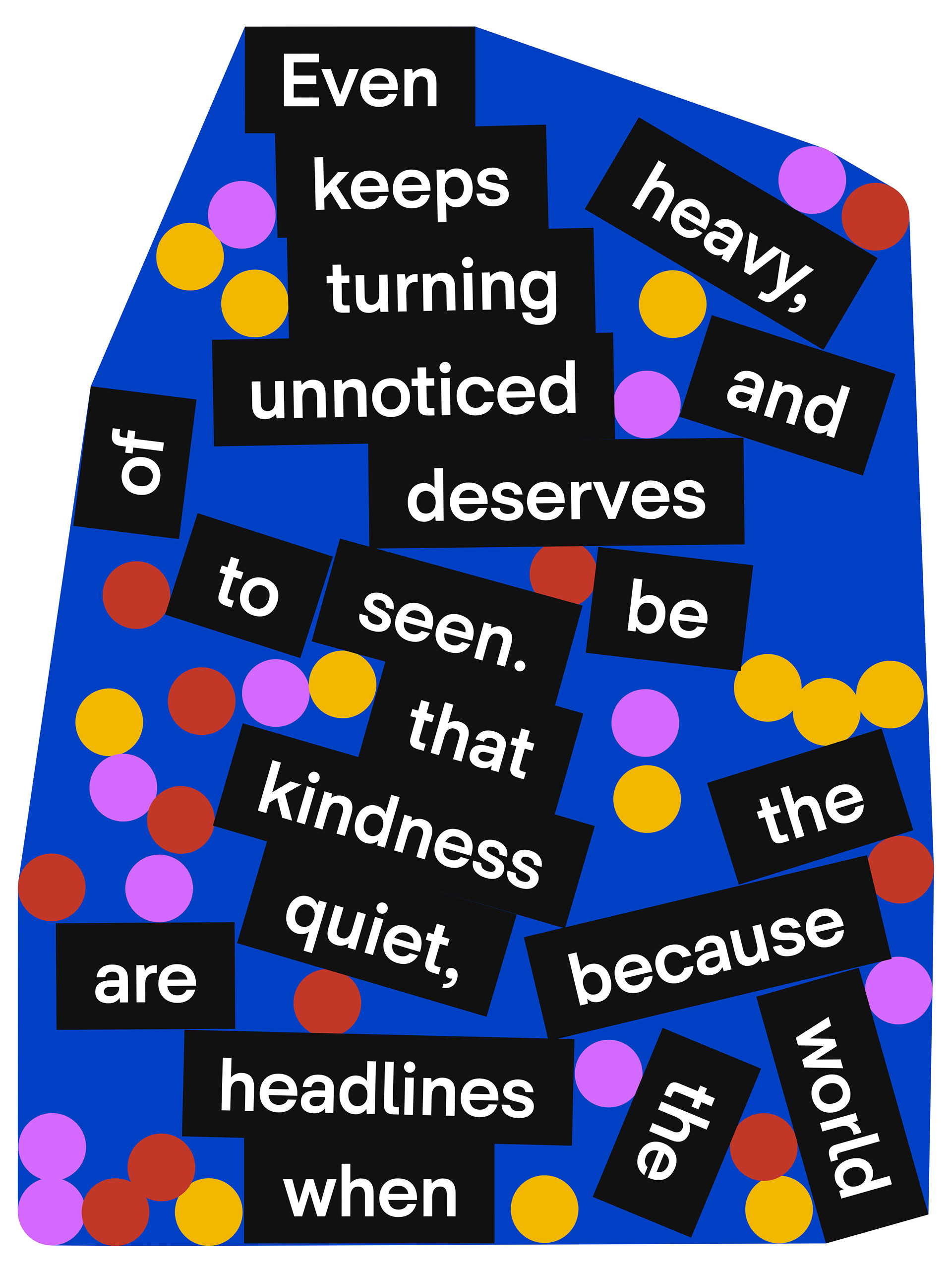
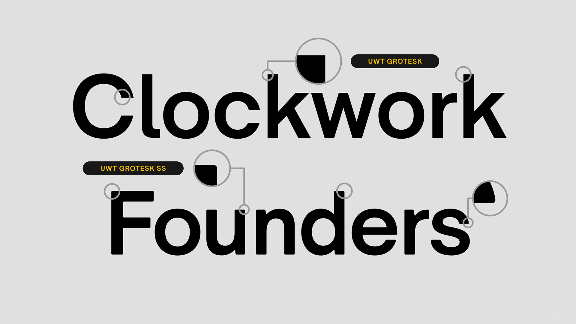
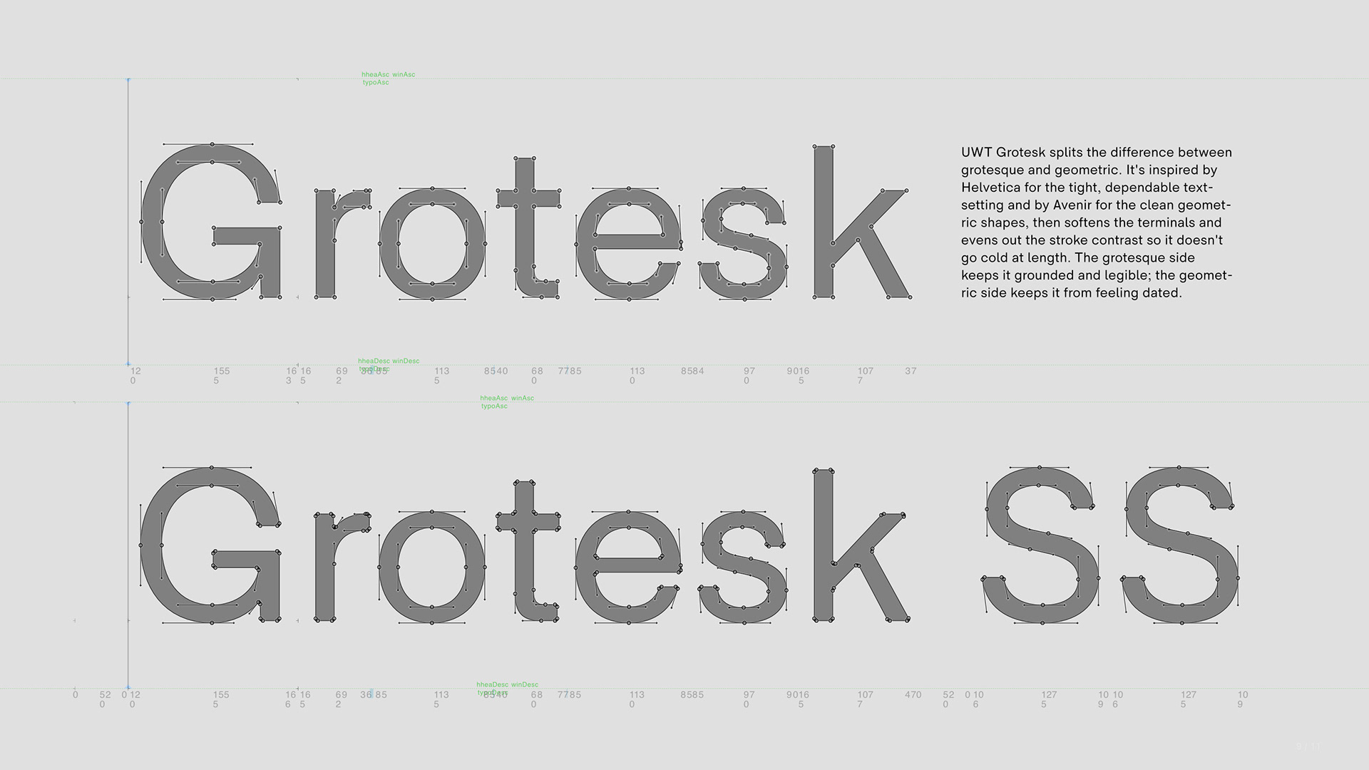
There's also UWT Grotesk SS (Semi-Soft), which takes the same structure and rounds the corners just slightly. It's a small change, but it shifts the overall texture of a page—a bit warmer and less severe, without drifting from the logic of the original design. Useful when the tone calls for something more approachable but you still want it to read as the same family.
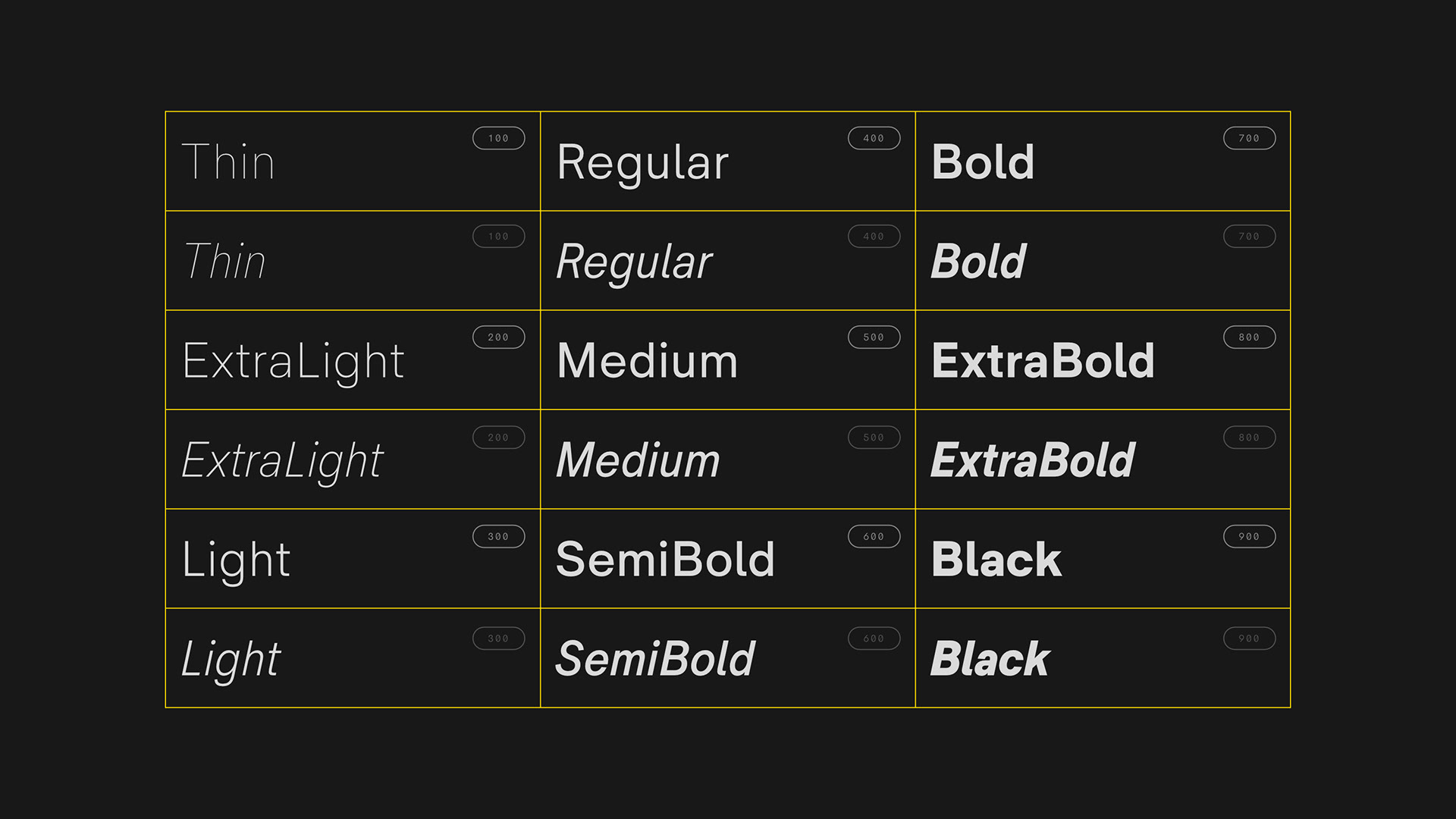
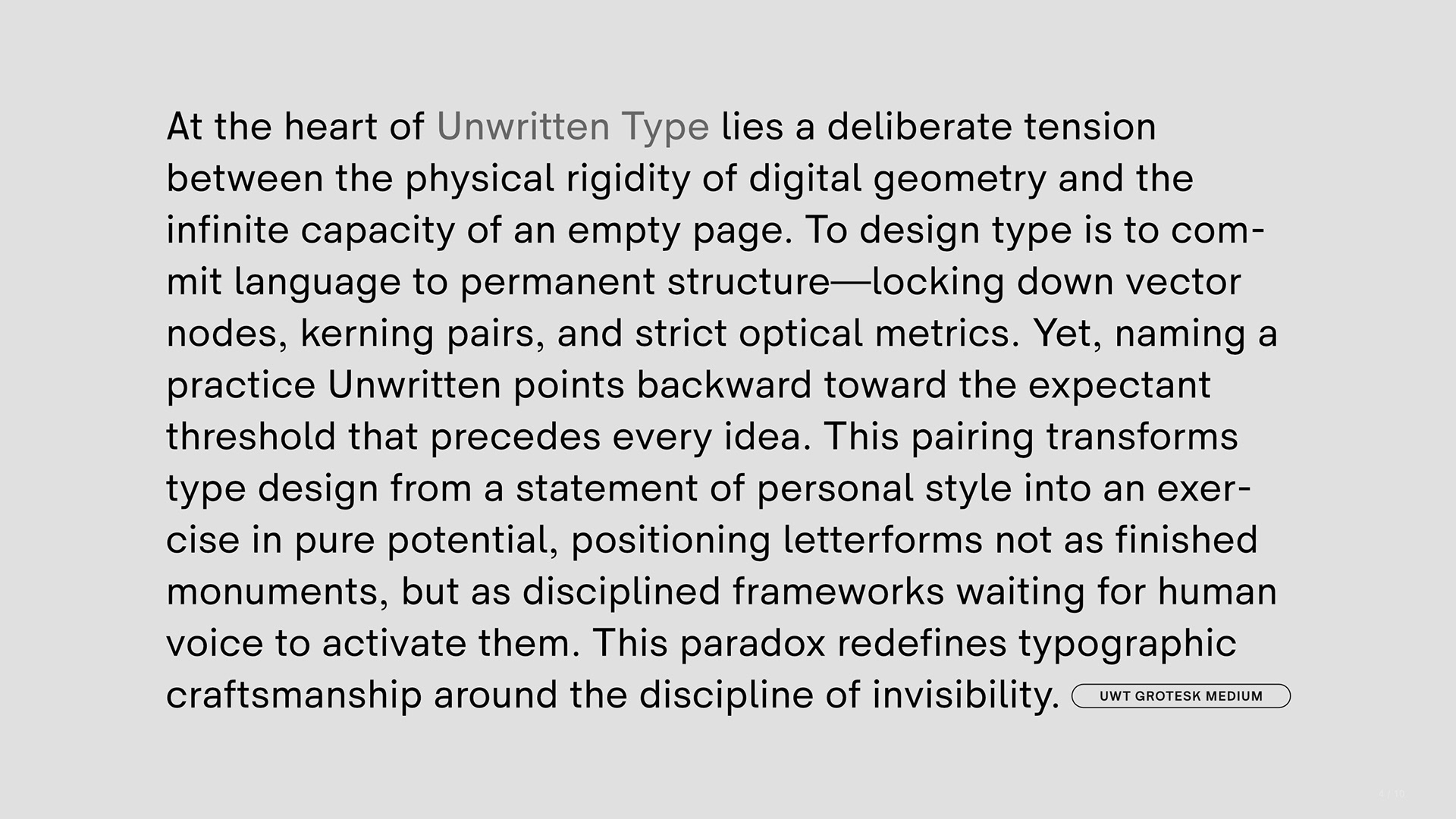
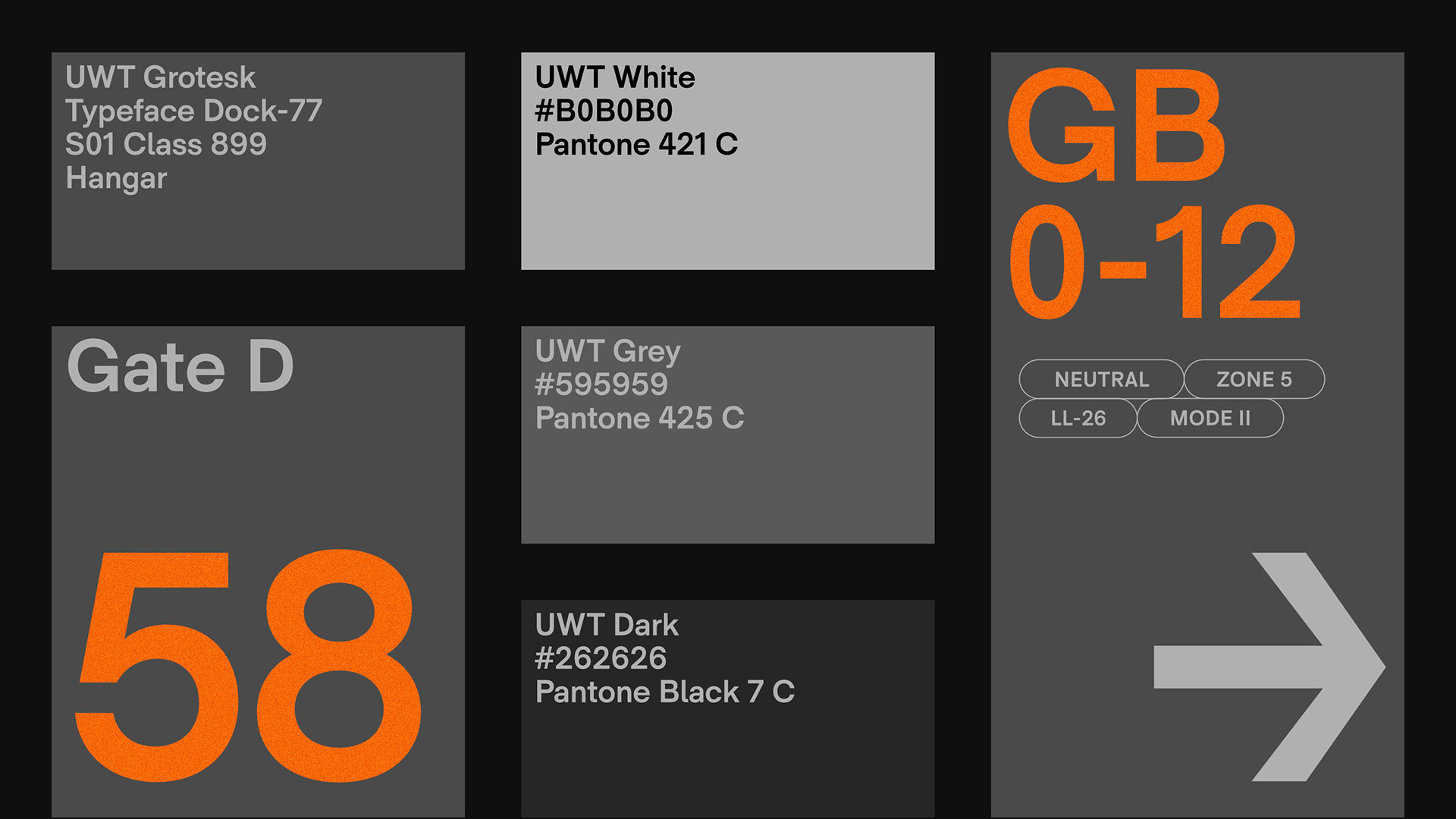
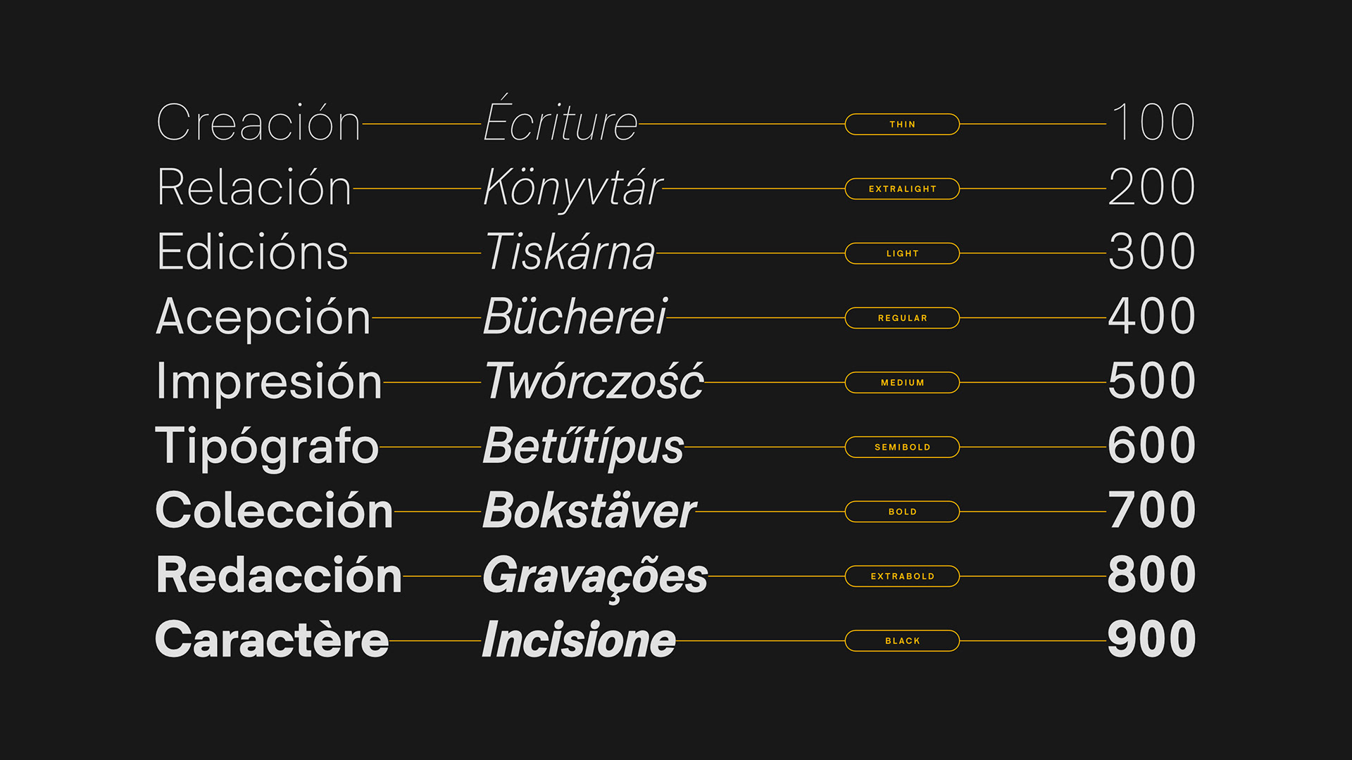
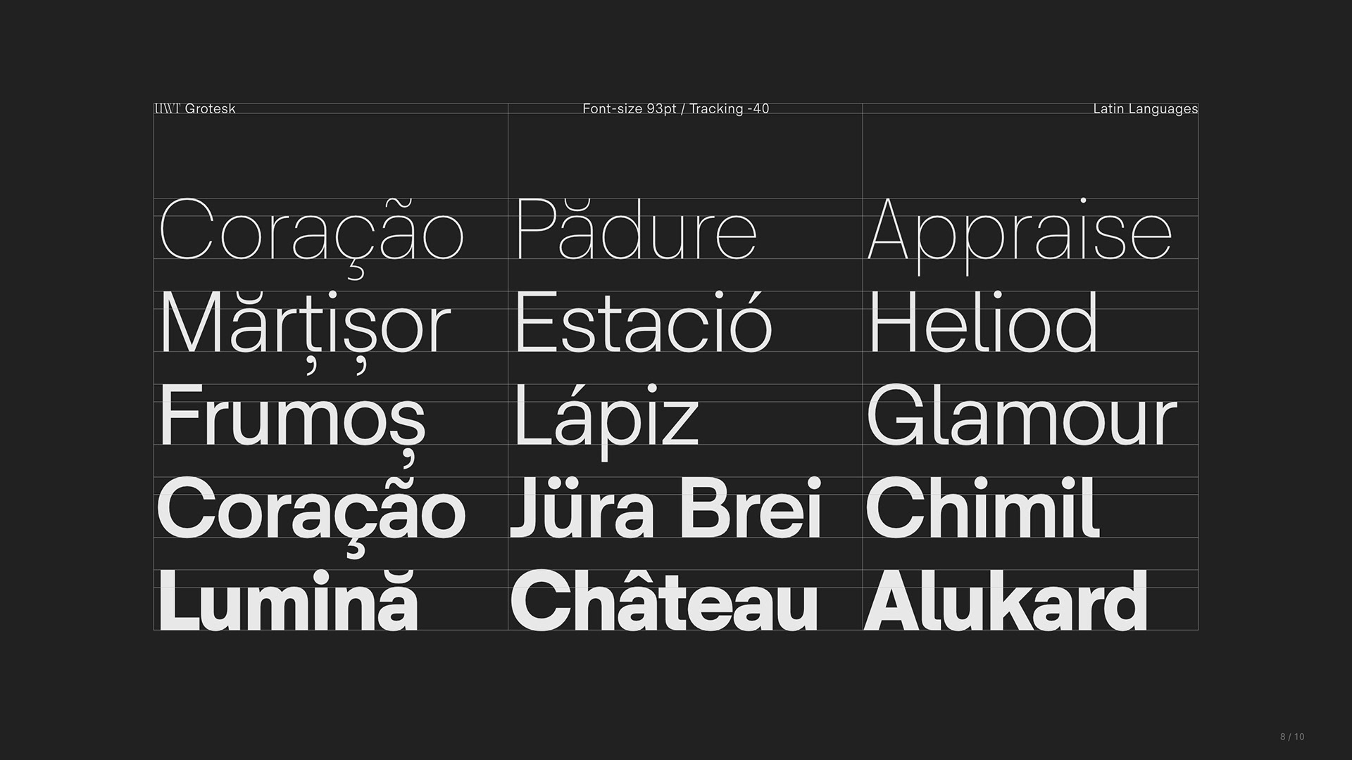
Nine weights, each with a matching italic.. eighteen styles in total, built to move as one coherent system rather than a pile of unrelated cuts. It holds up at 9pt body copy without the letters clogging together, and scales just as well onto signage, where you need shapes that read fast from a distance.
A couple of details worth knowing. The lowercase l has a tail, which helps it stay distinct from a capital I at small sizes [a small fix for a problem most grotesques never bother to address]. There's also an optional single-storey "Schoolbook" a you can swap in if you want something a little friendlier or more approachable in tone. Together, they keep the letterforms legible whether you're reading them on a screen, on a printed page, or from across a room on a wall.
Click here to download the FREE TO TRY FONTS.