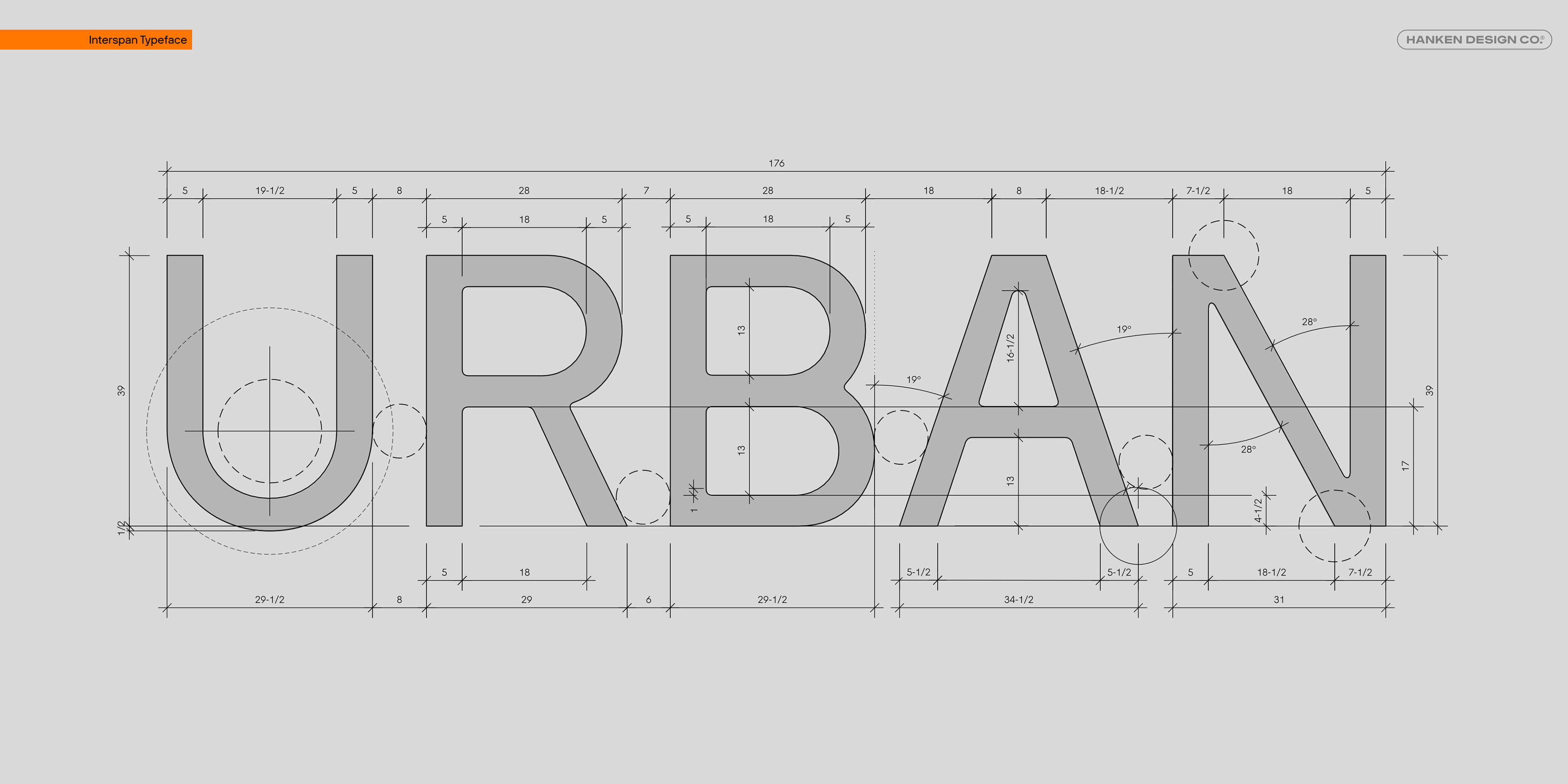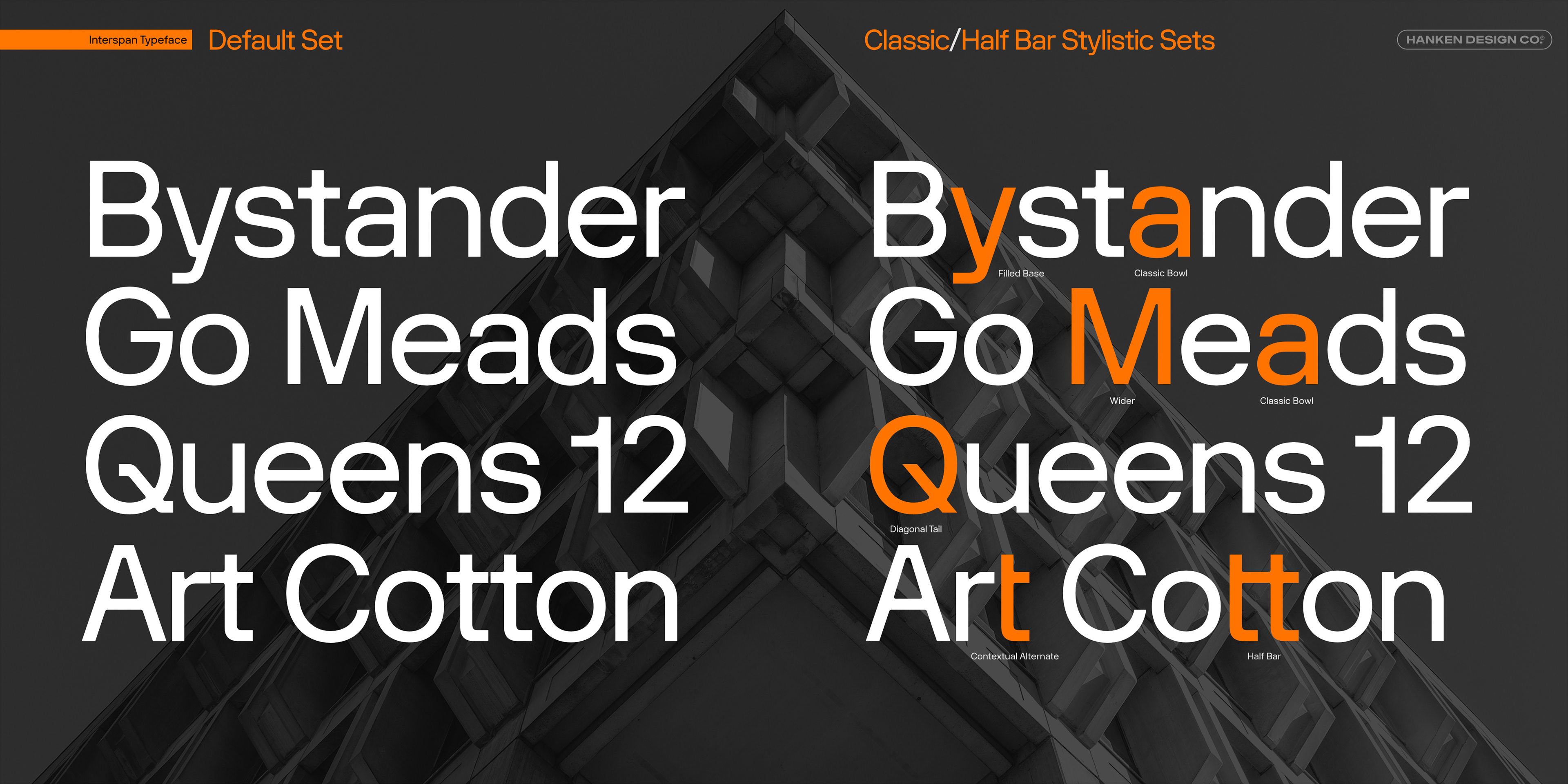
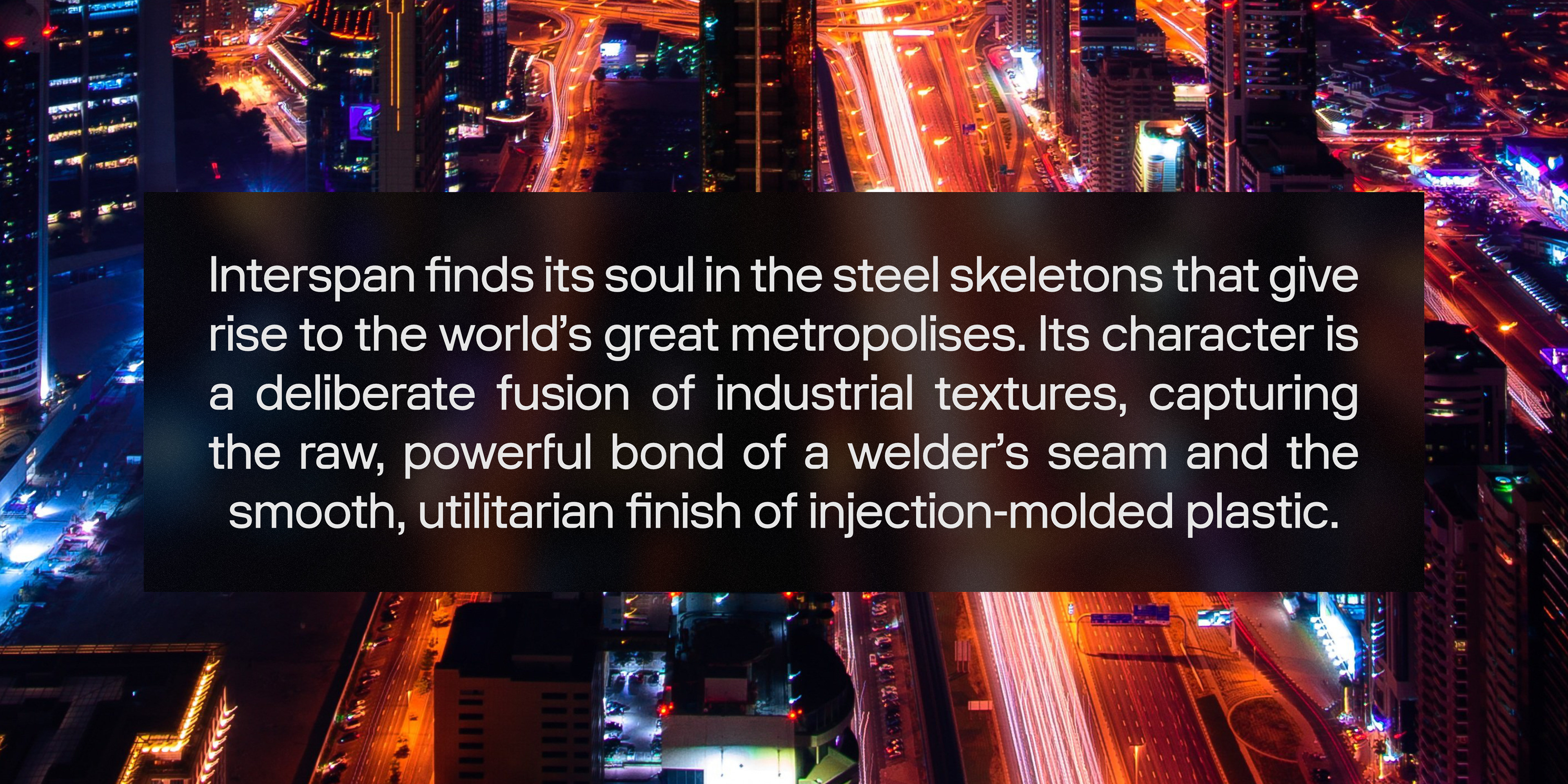
Interspan is not merely a collection of forms, but a study in the spaces that define them. Its design philosophy begins not with the stroke of a letter, but with the concept of the "span"—the relationship and the void that exist between structures. It finds its identity in the resonant gaps between industrial monoliths.
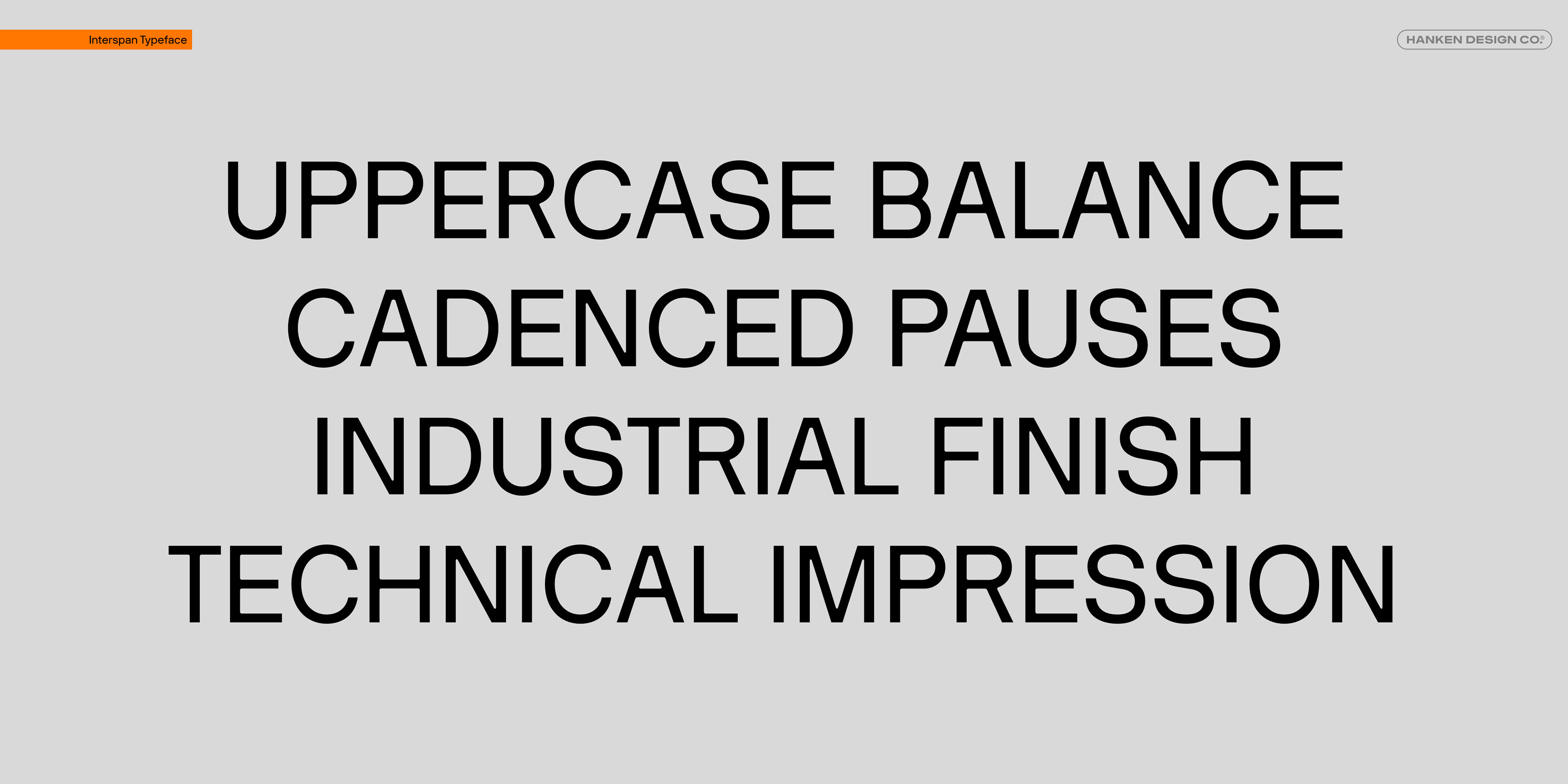
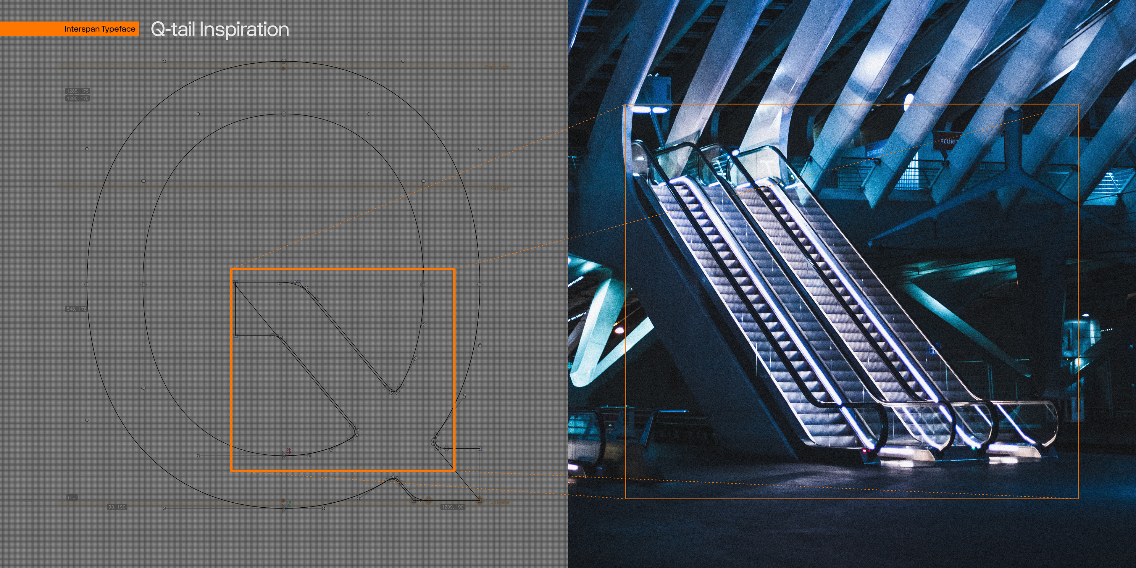
Each character in the Interspan family is conceived as a unique industrial span: a self-contained superstructure of steel and concrete, a pylon or truss with its own distinct silhouette and structural logic. But its true value emerges when these individual spans are set side-by-side. It is in this arrangement that the metropolis is formed. The negative space between each letter becomes a network of urban canyons and alleys, and the collective outline of the words creates a rhythmic, textured skyline. A line of text is no longer just a sentence; it is a dense cityscape viewed from afar, with each word a tightly packed district.
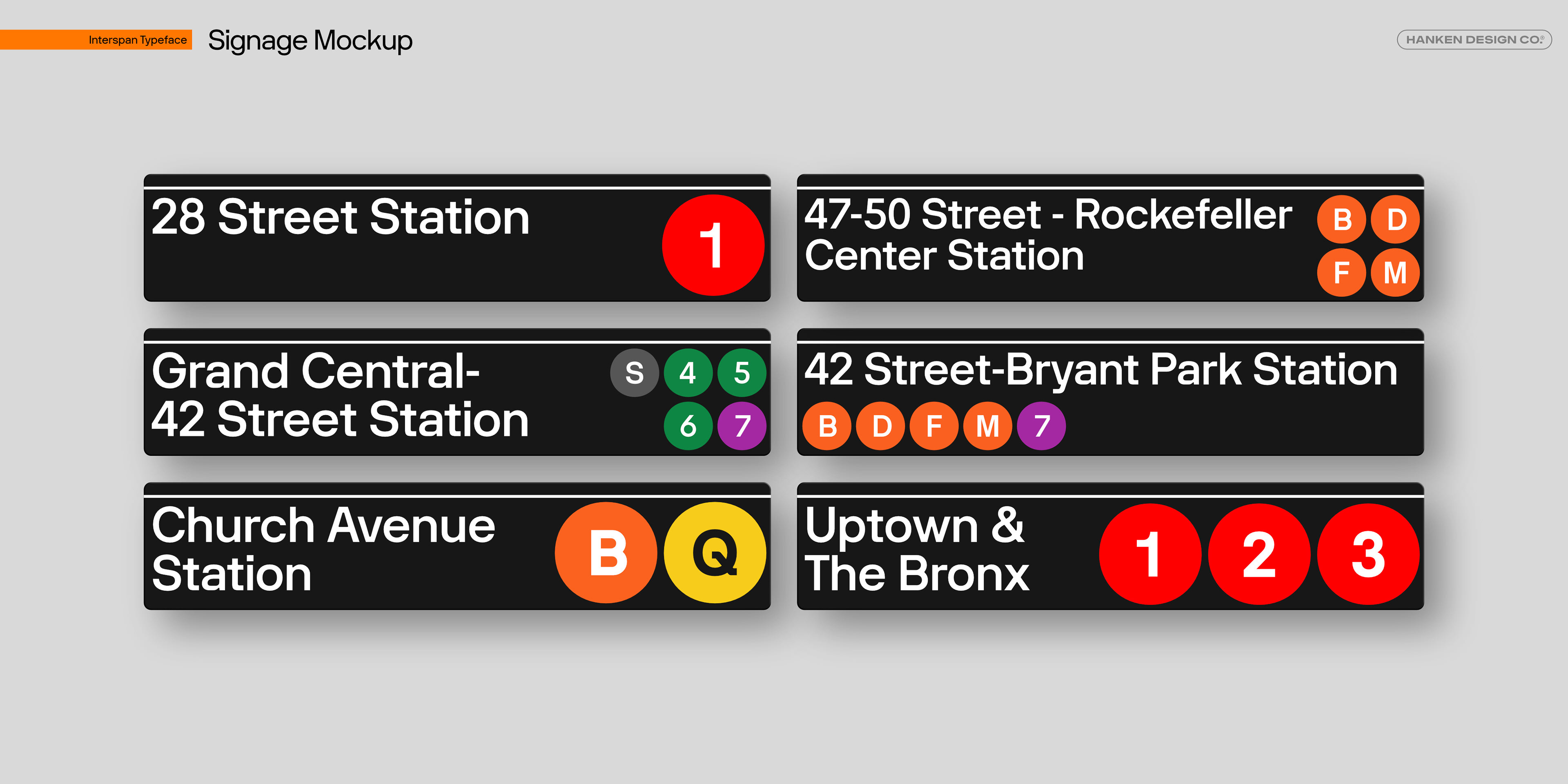

This deliberate dialogue between the solid forms and the carefully sculpted voids is what gives Interspan its unique cadence. The tension and harmony in these spaces ensure that despite its dense, structural feel, the typeface remains remarkably legible, guiding the reader's eye through the urban landscape of each word. Ultimately, Interspan explores the idea that communication is built not only from the structures we erect but from the vital, resonant spaces that exist between them.