
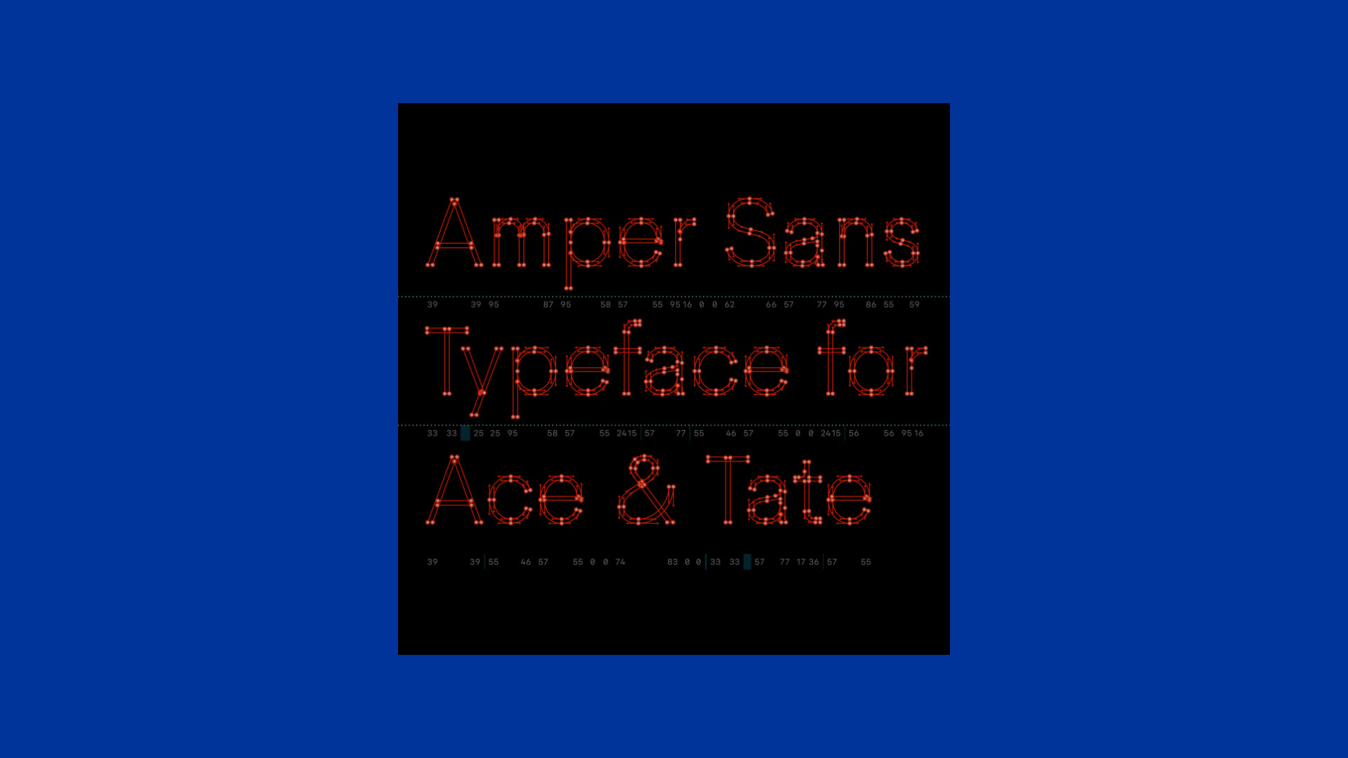
I had the privilege of designing a bespoke typeface for the renowned Dutch eyeglasses manufacturer, Ace & Tate. The objective was to create a contemporary and highly legible sans-serif typeface that seamlessly integrates with and enhances Ace & Tate's distinctive visual identity.
The conceptualization phase was thorough and methodical, focusing on developing a typeface that is not only modern and clean but also versatile enough to be used across various brand touchpoints. This involved an in-depth analysis of Ace & Tate's existing visual language, ensuring that the new typeface would complement their brand aesthetics while improving readability and user experience.
The final design is a harmonious blend of form and function, embodying the company's forward-thinking ethos. The custom typeface plays a crucial role in reinforcing Ace & Tate's brand presence, providing a cohesive and engaging visual experience for their audience.
Scope: Typeface Design • Font Development
Design: Alfredo Marco Pradil [HDS], Hanken Design Co.®
Client: Ace & Tate
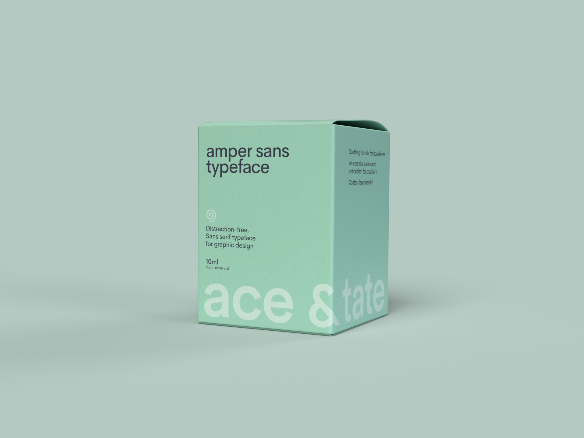
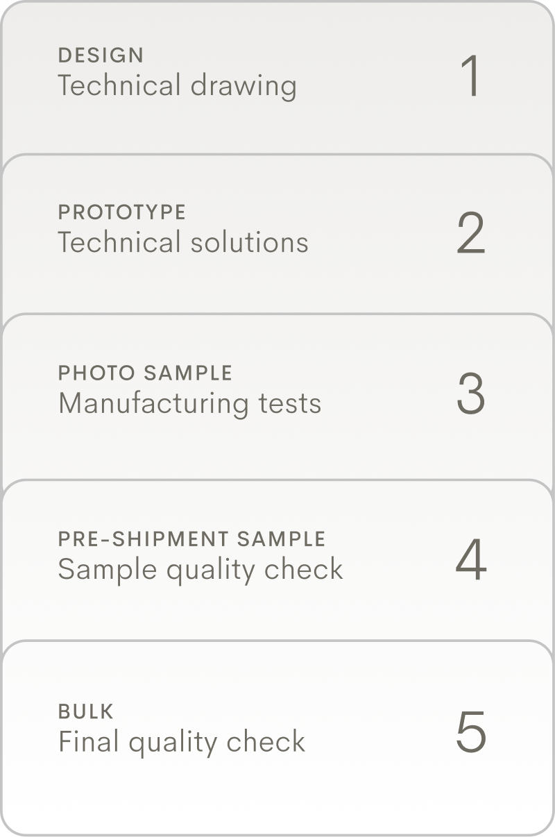
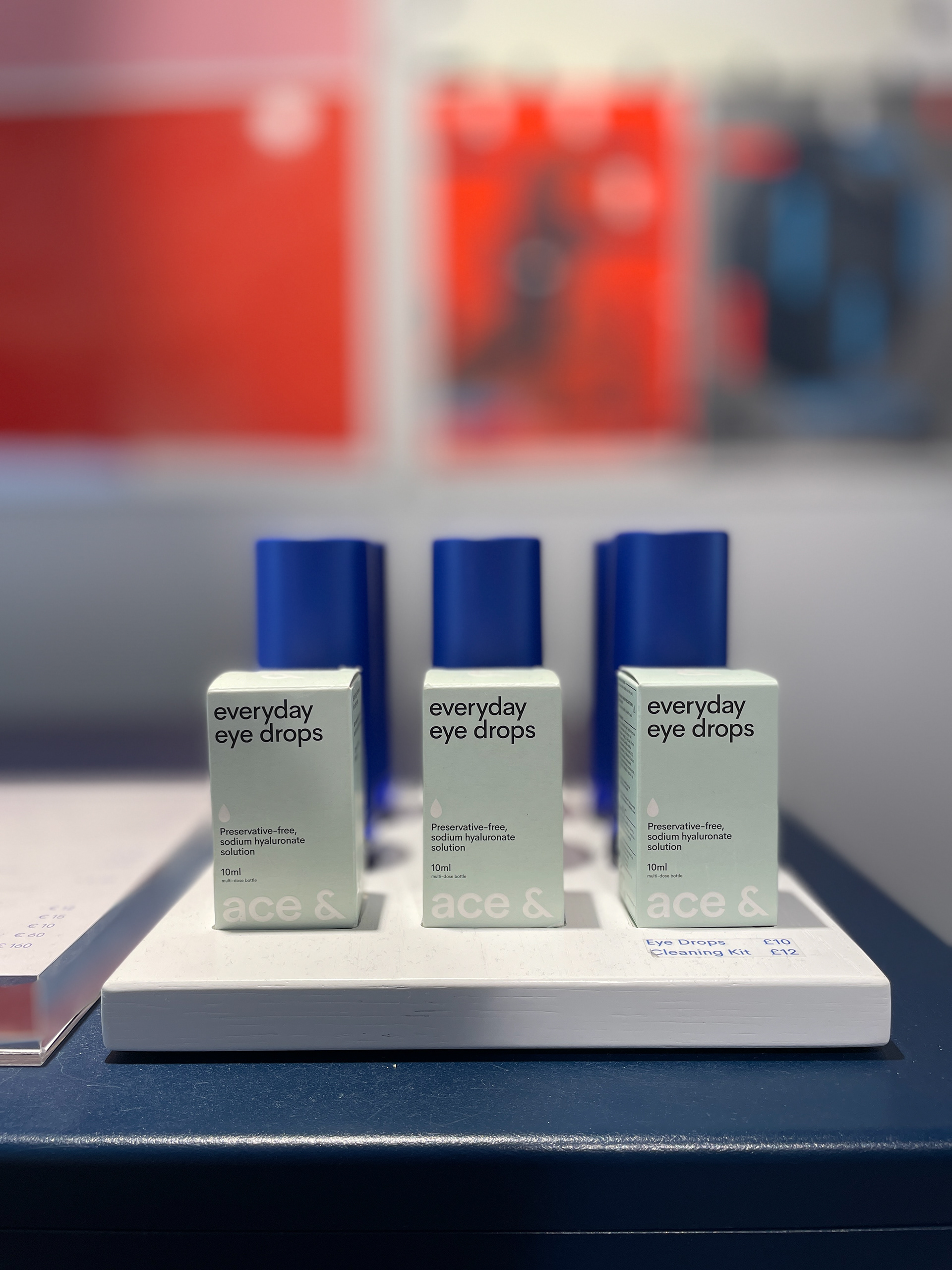
Disclaimer: This image is not an Ace & Tate official packaging. Just to present the Amper Sans typeface in a quirky way.

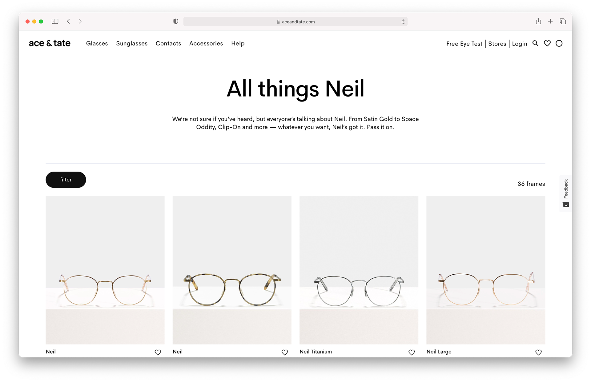
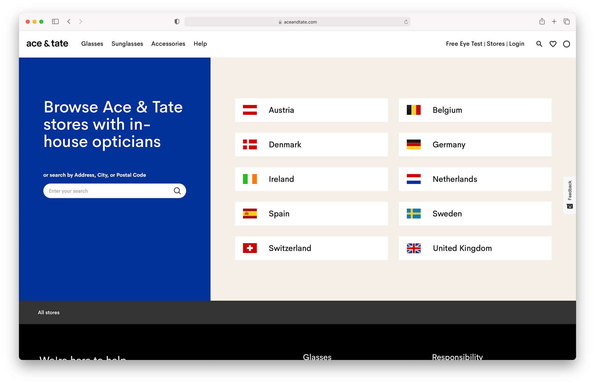


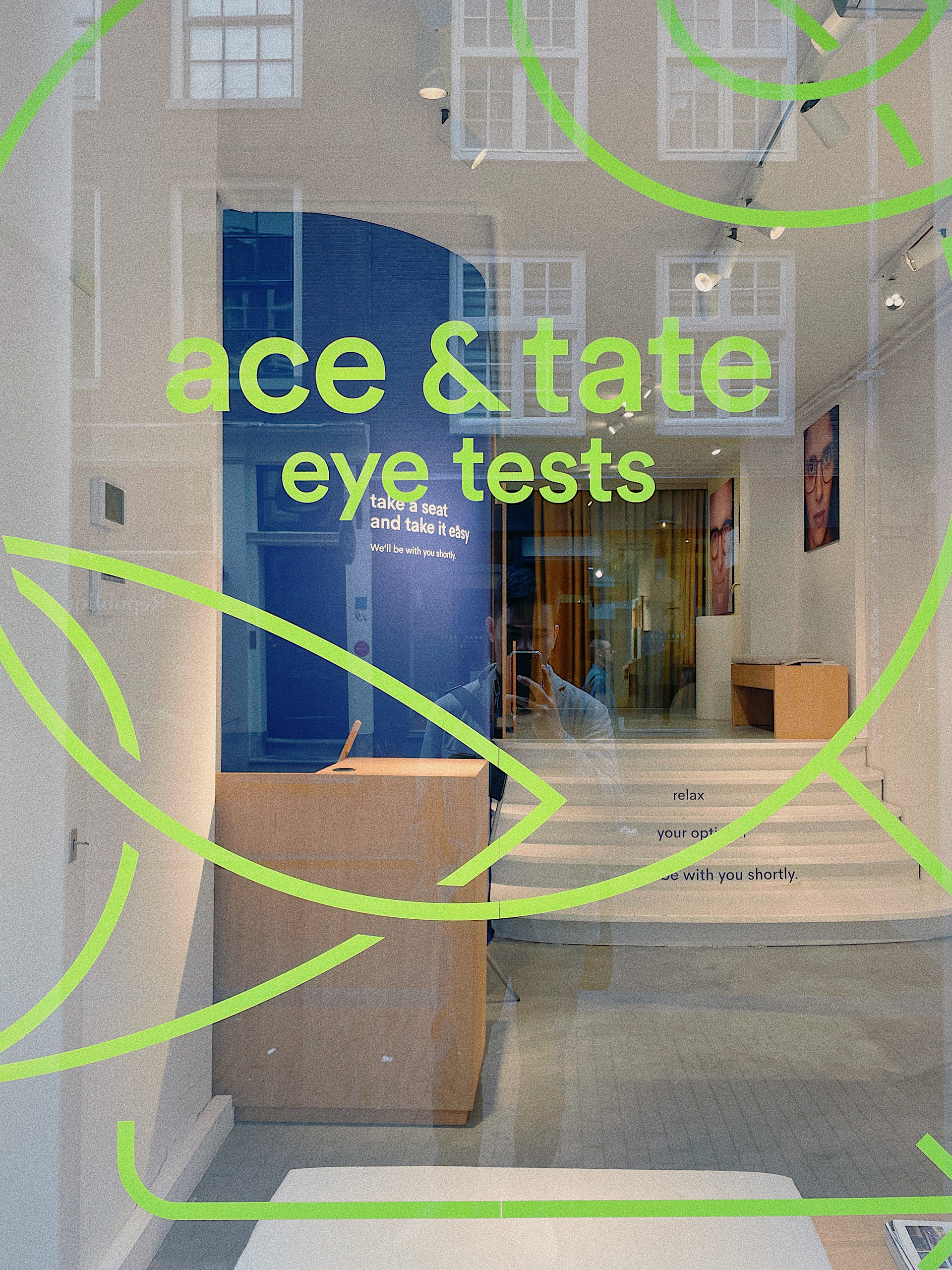
Website screenshots of the Amper Sans typeface in action (aceandtate.com)
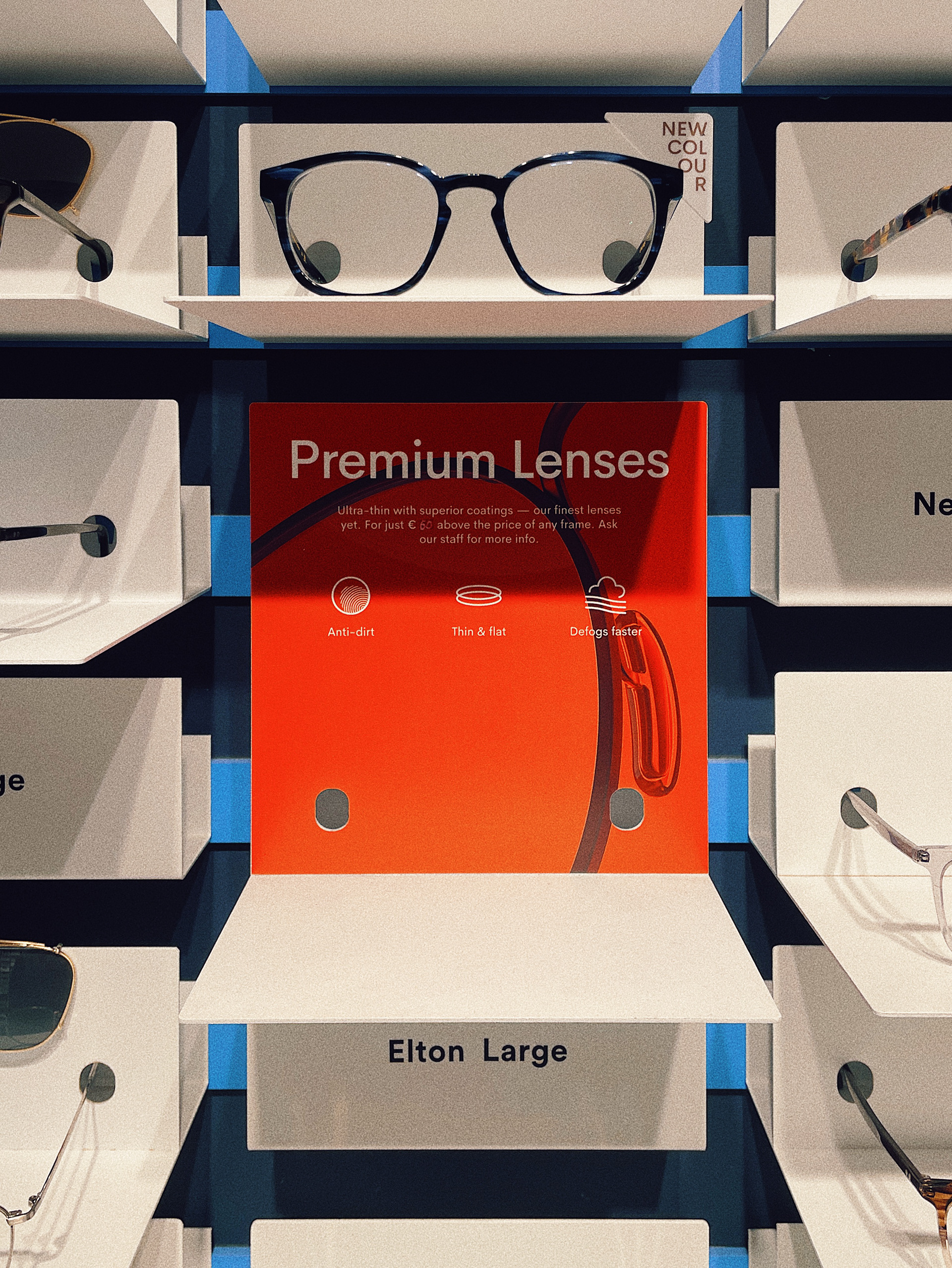
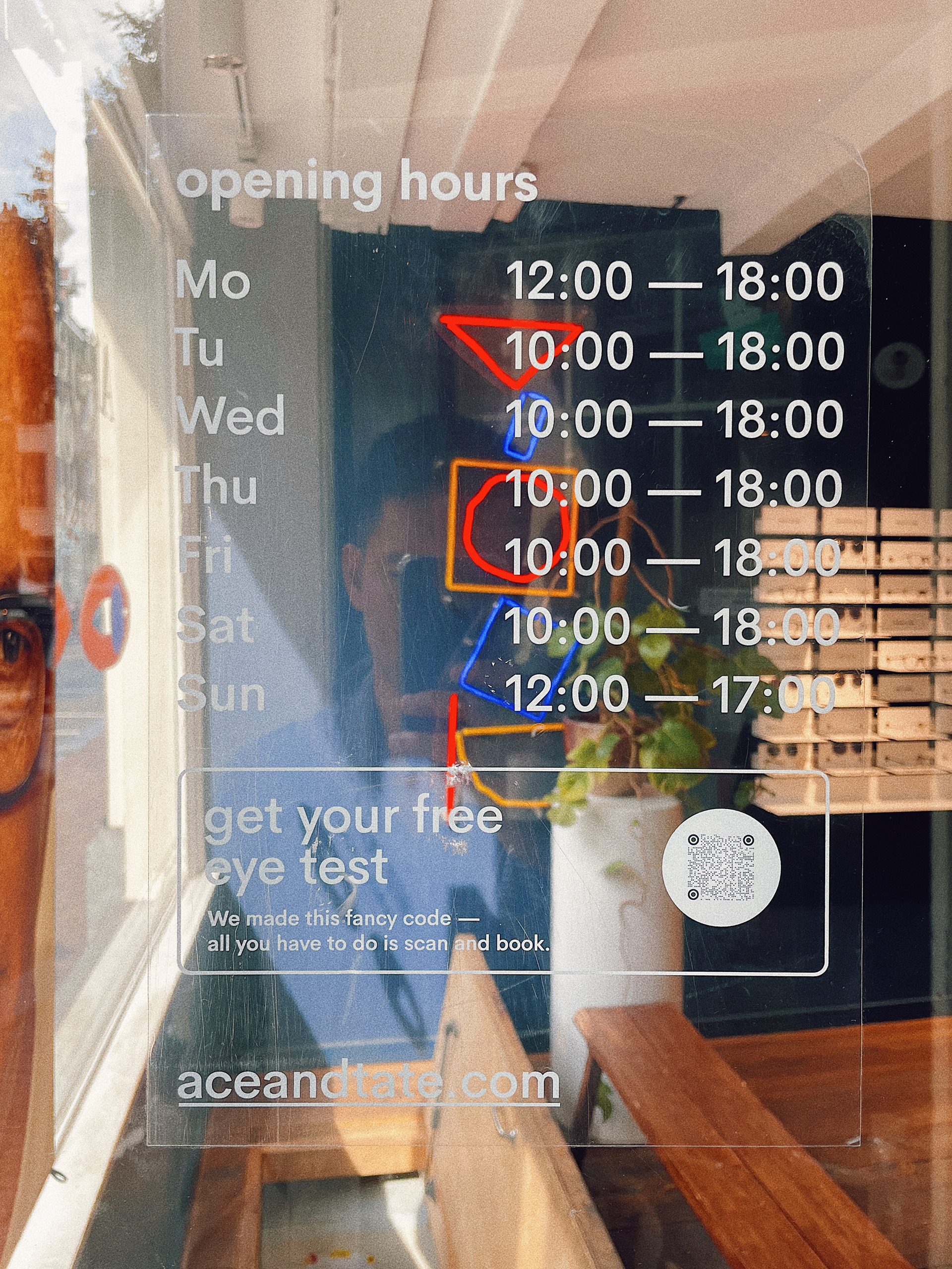
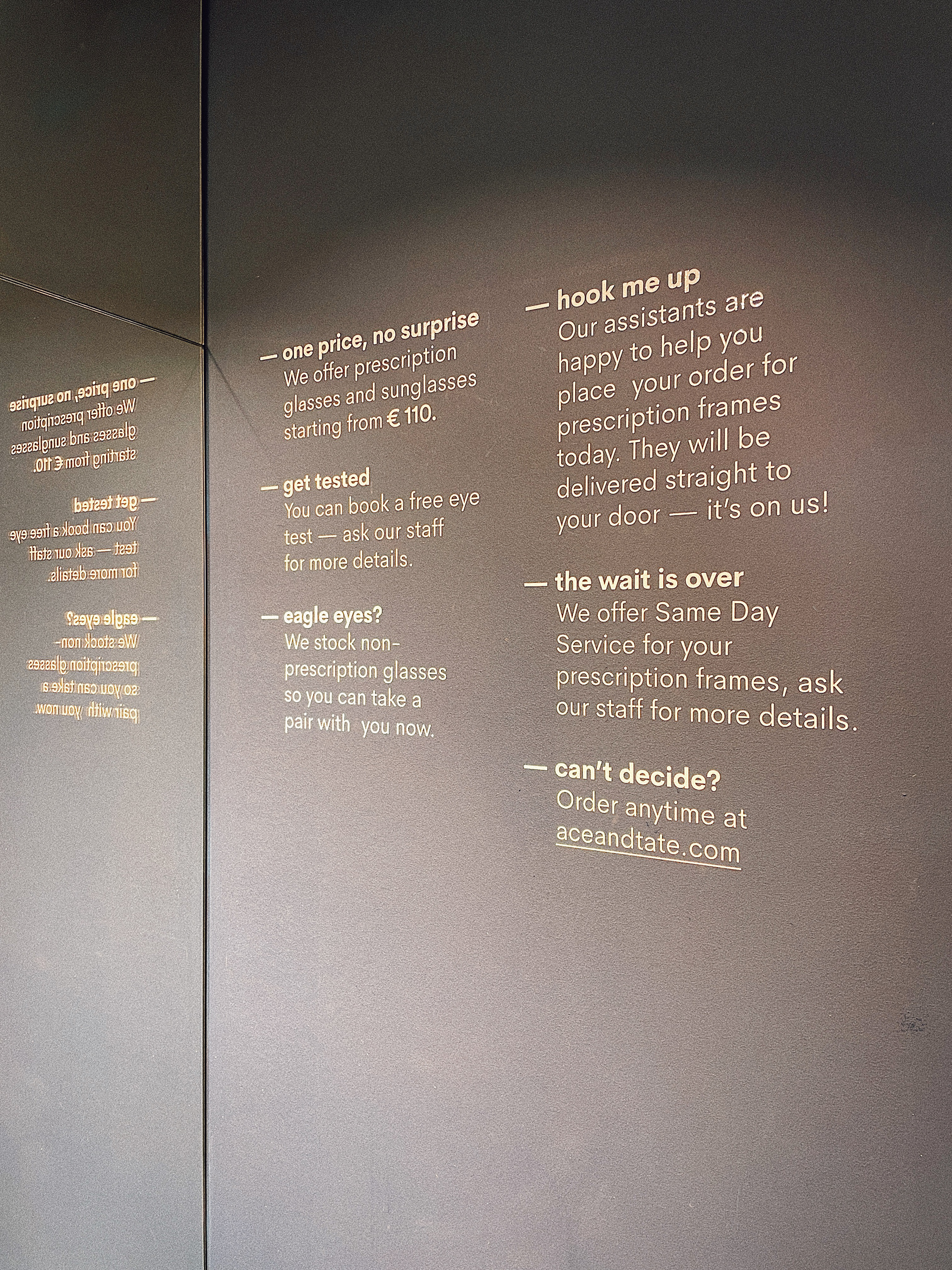
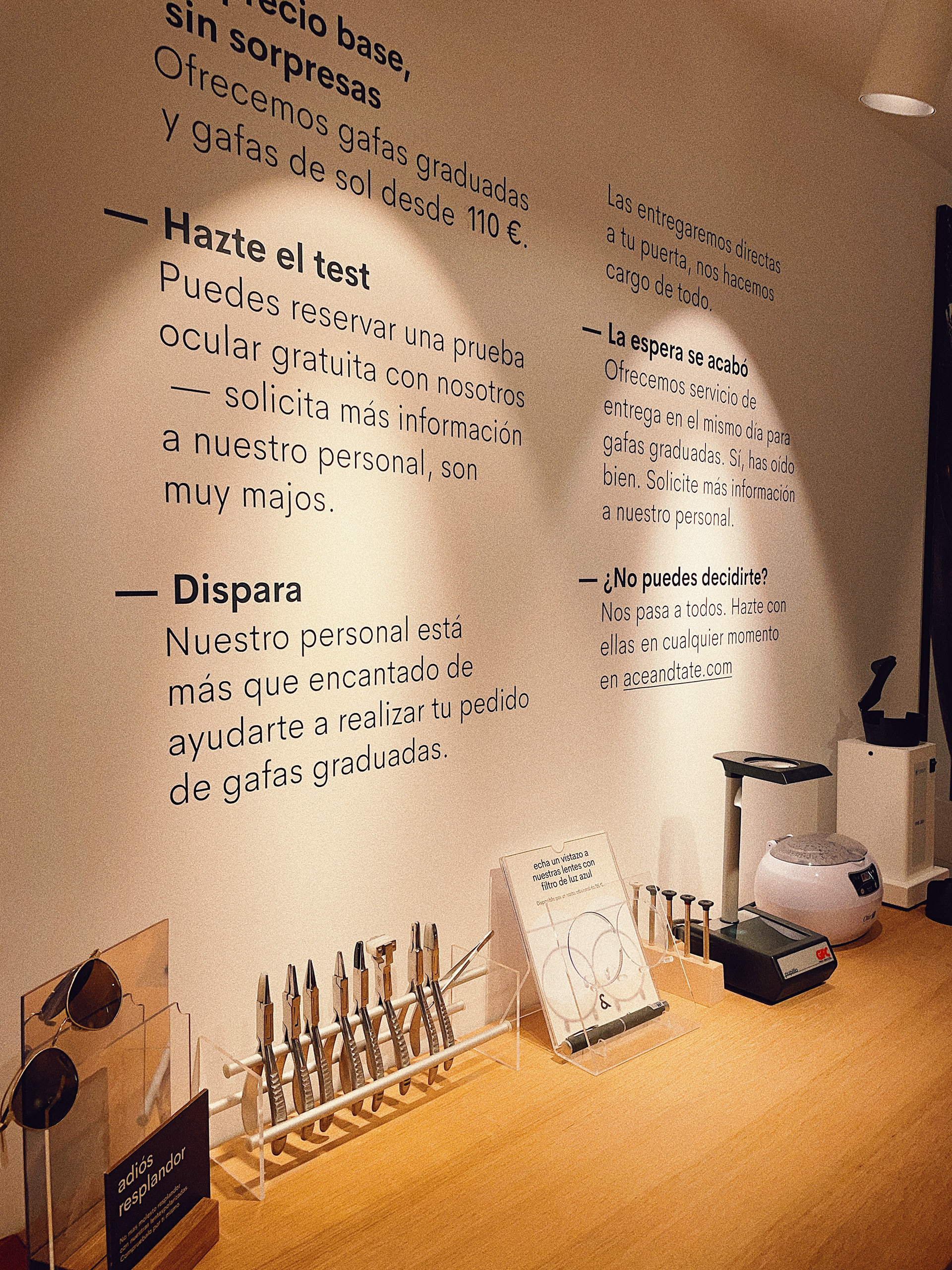
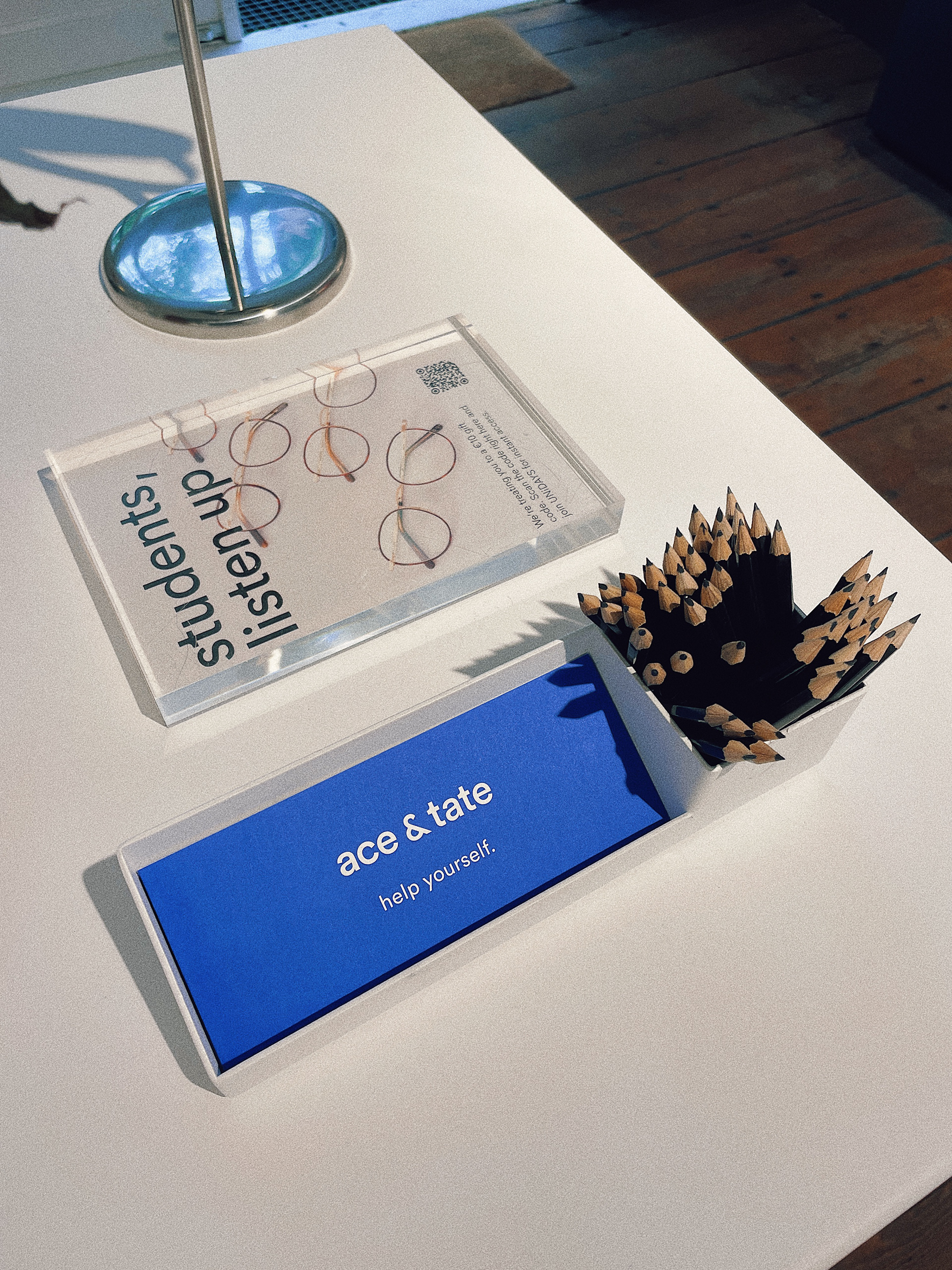
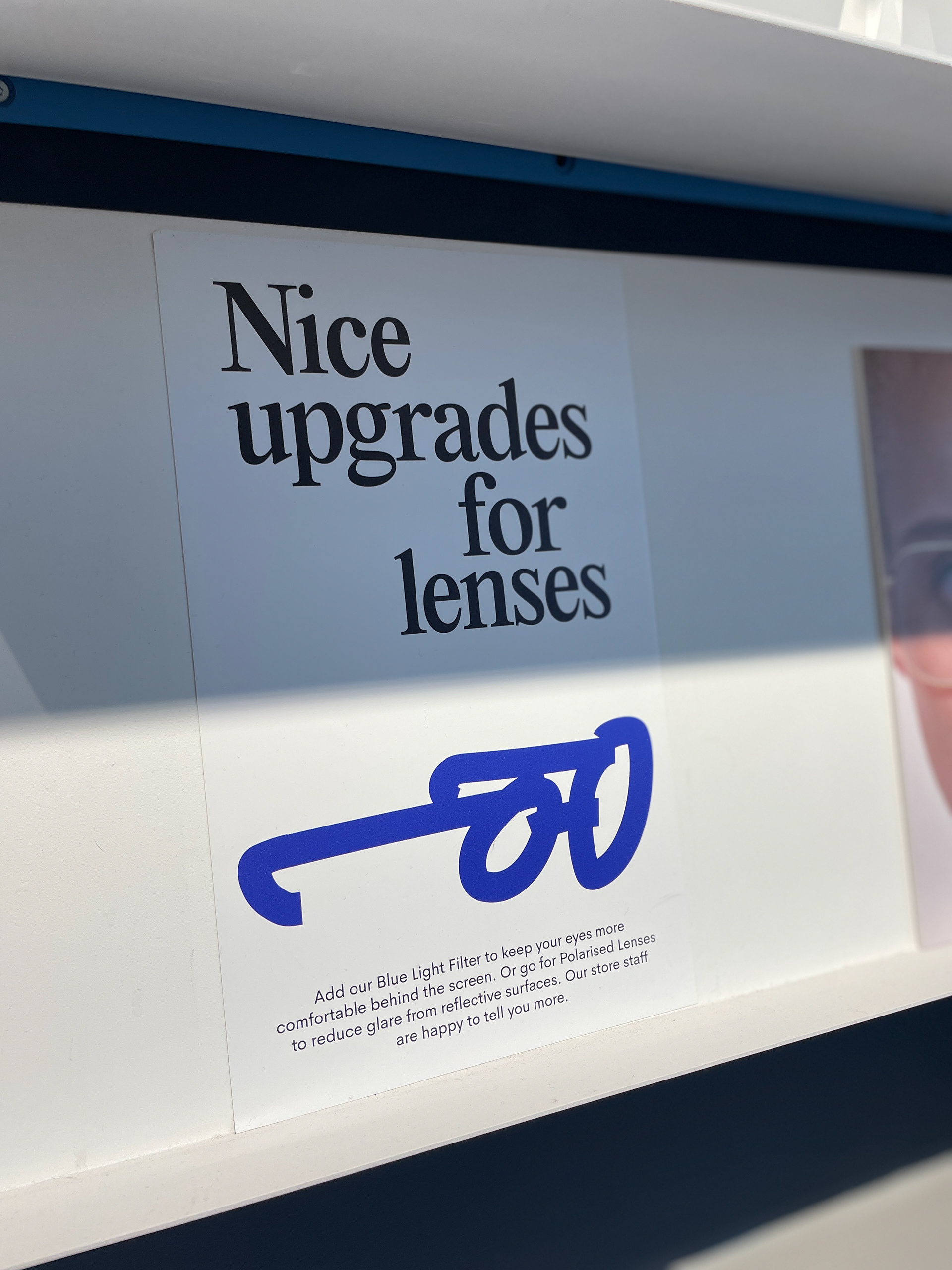
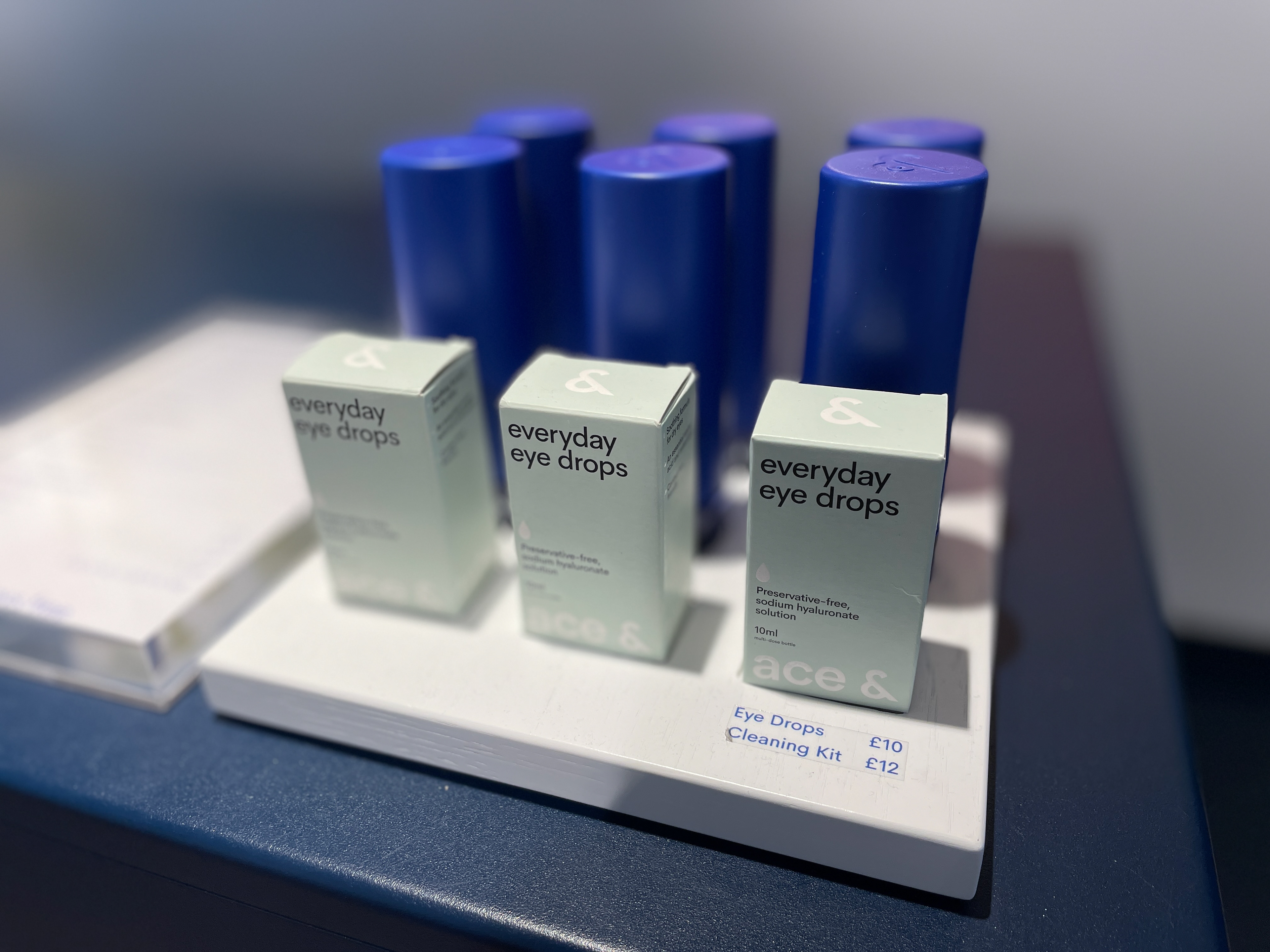
Photos of an Ace & Tate shop in Amsterdam with Amper Sans typeface in action.